J.J. Abrams’ new Starship Enterprise design revealed — oh, the pain!
I seem to be alternating between manic euphoria over the impending arrival of J.J. Abrams’ big-screen big-budget Star Trek relaunch/reboot/whatever, and tremendous pessimism that a film trying to re-cast the iconic roles of Kirk, Spock, etc., can’t possibly be good.
On the euphoric side of town, I have been breathlessly counting the days until the arrival of the first big trailer, which will be premiering this weekend. And most of the cast pictures that were revealed last month were very encouraging. (See my blog post from October 16th.)
Then Paramount released to Entertainment Weekly the design for the new Starship Enterprise.
Uh oh.
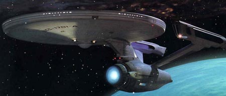
OK, so between the original Star Trek series from the ’60s, the movies, and all the subsequent TV show spin-offs, there have been a heck of a lot of different Enterprise designs out there. My favorite is the one from all the original Trek movies (Star Trek: The Motion Picture through Star Trek VI.)
This is known in Trek parlance as the “refit” Enterprise, as it looks quite a bit snazzier than the Enterprise as seen in the original series.
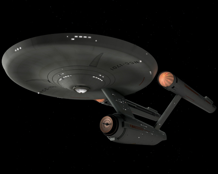
The reality is that the producers of Star Trek: The Motion Picture, quite rightly so, felt that the simple design of the original TV Enterprise wouldn’t hold up on the big screen. The explanation given in the movie for the new look of the Enterprise is that the ship has been in drydock for two years, getting re-fitted with the latest tech. It’s a bit of a stretch, but since the refit design is so magnificent people seemed to go with it.
So that brings us to J.J. Abrams’ new Star Trek movie. Although the plot is still a tightly-kept secret, it seems to be the story of Kirk and the gang getting together as young officers, before they were on the Enterprise… or perhaps very early on in their adventures on the Enterprise. In other words, it appears to be some sort of prequel to the events of the original Star Trek television series of the ’60s. That would indicate that the Enterprise seen in the movie should look something like the second Enterprise pic found above.
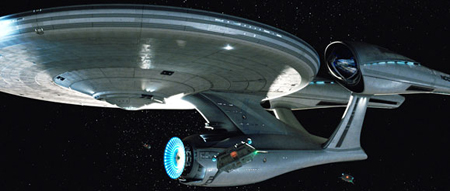
Well, instead it looks like this:
Now, look, I need to hold back my judgement until seeing the ship in motion. I remember seeing the first pictures of the X-Men in costume from way before the first X-Men movie came out… and seeing that first picture of Tobey Maguire in his Spider-Man costume… and both times thinking “oh my god, that looks horrible.” And yet, in both examples, in the actual movie I thought the costumes looked just fine. So one really shouldn’t judge one still early picture.
Still, I find the new design to be… well, pretty ugly!! Forget the continuity problems of this Enterprise looking more like the refit Enterprise than the original one. I can get past that. (Although the writers and producers are being very coy about it, it’s possible that the movie will wind up being a let’s-start-from-scratch reboot of the story, as opposed to an in-continuity prequel. So the Enterprise looking different is to be expected.) But to me this new design just looks sort of weird. It has all the elements of the classic Enterprise design — the circular primary hull, the cylindrical secondary hull, the two nacelles — but without any of the grace of the classic Enterprise look. The secondary hull is pushed way too far forward, the nacelles look too big and bulky, and they don’t sit well on the pylons that connect them to the secondary hull. And the pylons themselves look almost as if they were stuck on the ship upside down (with the wider parts attached to the secondary hull and then getting more narrow as they approach the nacelles, instead of vice versa). Scroll back up to the first picture to see the graceful sweep back of the angled nacelles and the nacelle pylons, and then look at the stubby-looking things coming off the new ship.
Am I over-reacting? Quite probably!! I really hope to be back here on Monday, after having seen the new Trek trailer, singing its praises and once again filled with intense anticipation for the new movie. And I’m sure some of you non Star Trek fans are looking at the new picture and saying, “I dunno, it looks like the Enterprise to me.” So maybe this is much ado about nothing. But for right now, I am worried that the makers of this new Star Trek movie are playing way too fast and loose with the core elements of the franchise. Prove me wrong, J.J.!!


