The Beast and The Booth: Creating a Cover!
The Beast and the Booth is my latest comic book — it’s a thrilling, all-ages story that weaves together a Jewish tale of faith and family with a supernatural monster adventure. Set during the holiday of Sukkot, the story follows Sarah, a 14-year-old girl who befriends a boy with a terrifying secret. When the sun sets and the full moon rises, Sarah must confront the beast that lurks beyond the Sukkah.
The book is available to order right now!
The Beast and the Booth is my latest collaboration with author Arnon Shorr; our previous projects are José and the Pirate Captain Toledano, our graphic novel about Jewish pirates, and Brother’s Keeper, which tells the true story of Arnon’s grandfather’s experiences in Israel’s 1948 War for Independence.
One of the most exciting — and challenging! — part of creating a new comic book is designing the cover. Although I believe there is wisdom in the old saying that one should never judge a book by its cover, many people do! The cover is the “face” of your story to the world. It’s the first thing most potential readers see, and it’s what many readers use to judge whether they’re interested in your comic book and your story… or if they’re not and want to move onto the next thing.
I started thinking about what I wanted the cover of The Beast and the Booth to look like very early in the process — soon after reading Arnon’s script! But it was after I’d finished penciling the book that I really began to think about the cover in earnest. I knew I wanted the book’s three main characters — Sarah, her dad, and the monster — to be on the cover. (Though I wasn’t sure at first if I should actually show the monster, or just hint at it, thus keeping its reveal more of a surprise for when one was reading the comic.) I knew I wanted the Sukkah to be seen in the image, because to me that’s what made this story unique and Jewish. And I knew I wanted to evoke a tone that would be spooky and mysterious, but not too creepy or scary, because we wanted this to be an all-ages book.
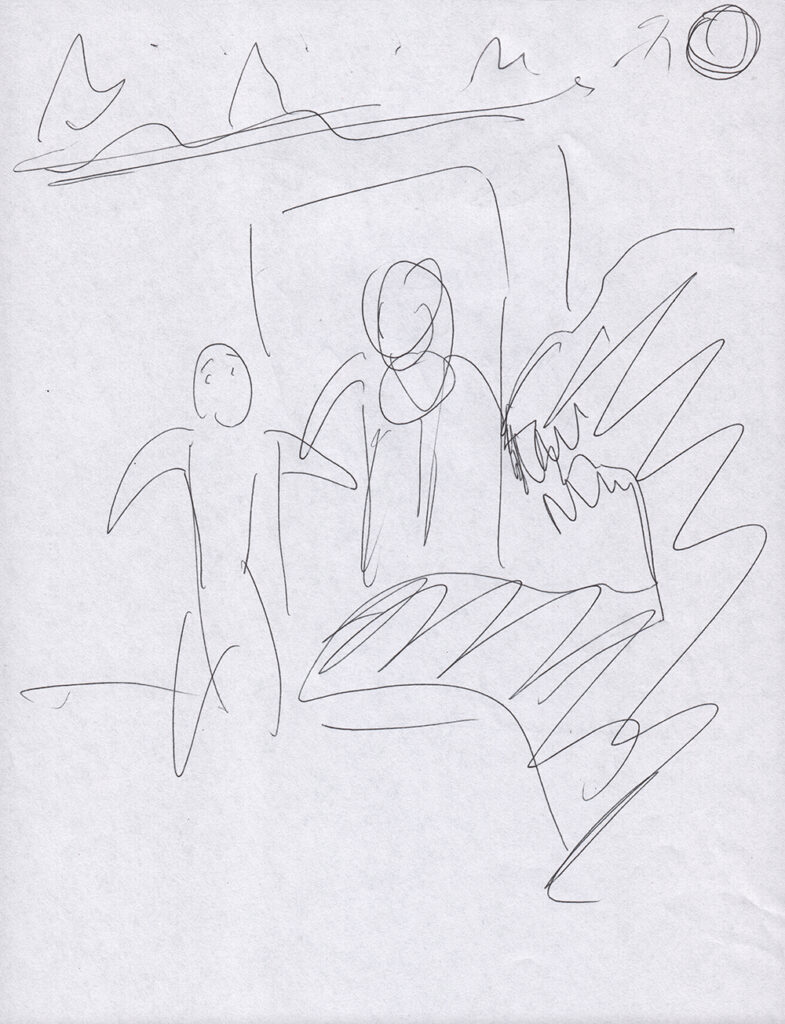
During one of my early conversations with Arnon about the cover, I dashed off this doodle:

I’m not sure if you can make it out, but the idea was Sarah and her dad standing in front of the door of the Sukkah, with stars and a full moon overhead, and the werewolf looming in the foreground (on the right side of the page). It’s funny to think that this is actually pretty close to what the finished cover wound up being!
As I was drawing the book, I found that I seized upon the image of Sarah, when first confronted with the werewolf, taking a lulav — the only thing she could find that could resemble a weapon — and holding it up like a sword. I loved this notion from Arnon’s script, and I was very happy with how this came out on page 11 of the book:
So when it came time to start working seriously on the cover, I did several sketches that combined the pose from that panel with my original idea:
That sketch on the right was designed in the style of the old EC Comics covers. Those were very iconic horror/scary comics. I liked the idea, but I worried it might be too obvious a choice, so in the end Arnon and I decided not to go in that direction.
Using the middle sketch as my guide, I set out to actually draw the cover. My first step was to draw it in pencil:
If you’ll look closely, you’ll see I extended the drawing beyond the usual borders of a standard comic-book page. That’s because we wanted the printed cover to be full bleed — meaning the image would extend right up to the edges of the cover, without any sort of border. To do that, my original drawing would have to be slightly larger than the final printed image, so the printed cover could be cut to give that effect of the drawing going right up to the edges.
I was happy with how the penciled version looked, so then I moved on to inks. In the inking stage I sharpened up the line-work, tightening the looser pencil drawing and making decisions on what lines were best. I wanted there to be some bold blacks which would help to create a strong, eye-catching image. Here’s the finished inked version:
Then our colorist Aljoša Tomić worked his magic. I gave him a few sentences of suggestions for the tone I was hoping the colors would evoke, and he knocked it out of the park. Meanwhile, Arnon brought his design skills to bear in creating a cool logo treatment for our title. And voila, we had a finished cover:
I think this finished project looks pretty snazzy, if I do say so myself!
Click here to order yourself a copy of The Beast and the Booth!
Please support my website by clicking through one of my Amazon links the next time you need to shop! As an Amazon Associate, I earn from qualifying purchases. That means I’ll receive a small percentage from ANY product you purchase from Amazon within 24 hours after clicking through. Thank you!


