The Tomb of the Broken Amulet: Designing a Cover!
I’m extremely excited to launch my latest comic book, The Tomb of the Broken Amulet! It’s an all-ages Passover mummy adventure, written by Arnon Shorr and with beautiful colors by Aljoša Tomić.
In the story, four Israeli siblings find an ancient tomb in the Judean Desert, and accidentally awaken a guardian mummy whose missing amulet holds the key to their survival-and a lesson about loss, hope and redemption. The Tomb of the Broken Amulet is an action-packed, heartwarming adventure about family, resilience, and finding hope in unexpected places. The book is available for pre-order right now; Arnon and I will sign all copies ordered before April 1st!
One of the most fun — and challenging! — aspects of illustrating a new comic book is designing the cover! The cover is so important. It’s got to introduce readers to the story, and capture the most important elements of the story. That can include the characters, the theme and tone, and perhaps a key event from the story. It’s got to do all of that in a way that is tantalizing to a potential new reader. Many readers will make the decision as to whether or not they’re going to buy your book just by looking at the story!
While penciling the book, I started thinking and talking to Arnon about possible cover ideas. If time permits, I like to wait to draw the cover until I’ve finished penciling the entire book. That way I’ve gotten to know the characters and the story, which I feel puts me in the best position for being able to encapsulate it into a cover image. I started off by sketching out several ideas. As you can see, these were very rough sketches, basically scribbles:
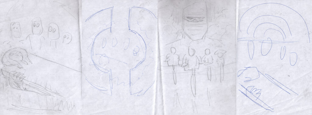
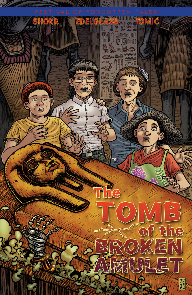
The sketch on the left is the one Arnon and I chose to go with, showing the four kids as the mummy emerges from its sarcophagus. The next sketch would have the two pieces of the broken amulet in the foreground, with the four kids seen in the middle. The next sketch would focus on the Amblin Entertainment/Stranger Things adventure vibe of four kids on their bikes, with the mummy looming in the background. The sketch on the right is basically the same idea as the first sketch, albeit with half of the broken amulet looking large in the background, behind them.
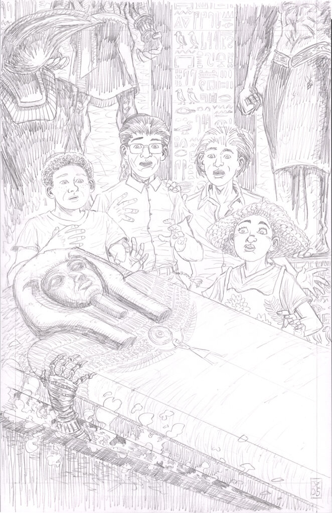
Arnon and I liked all of these ideas! But we felt the first one was the strongest. With that decided, I started work on penciling the cover. I had a lot of fun drawing this, and the finished piece came relatively easily:
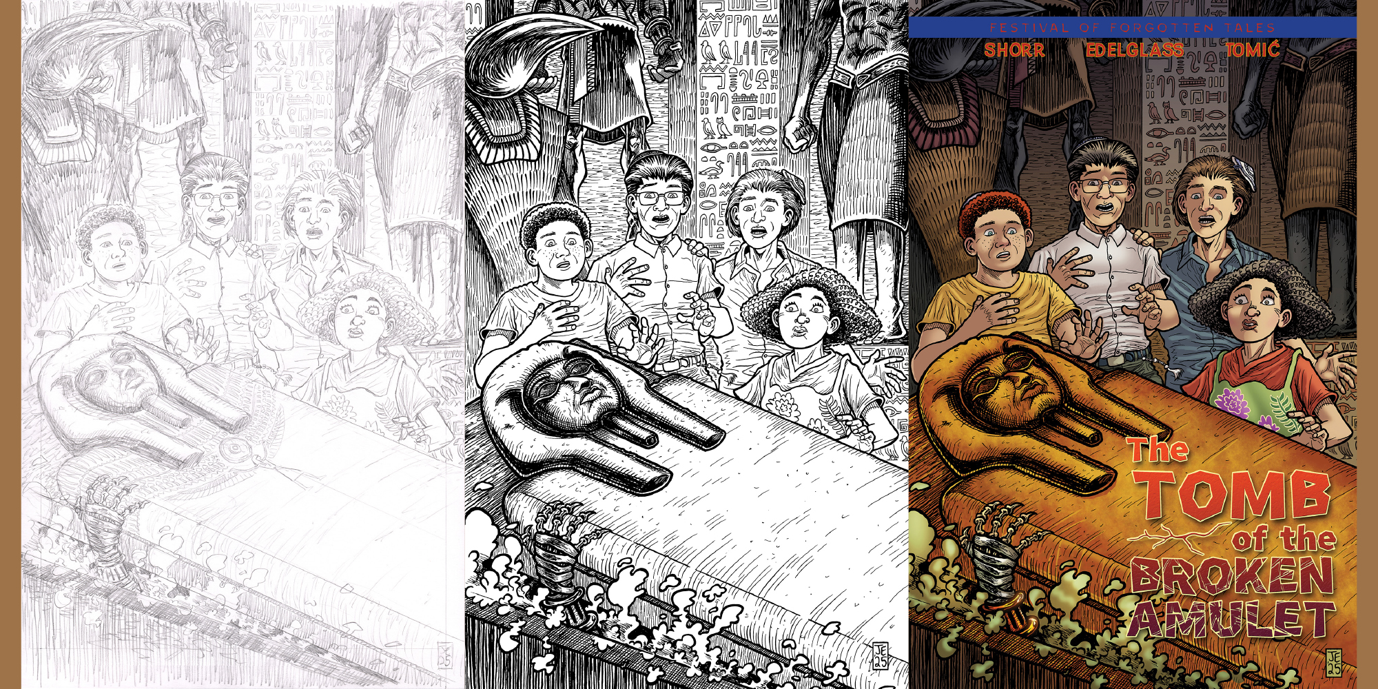
The next step was to ink the piece. In the inking stage, my mission is to make sure that there are clear, strong lines to catch the reader’s eye, and to ensure that all of the detailed linework adds texture to the image without being too overwhelming or distracting. All of the detail in the drawing meant that it took me a while to ink this piece, but I was very happy with the result.
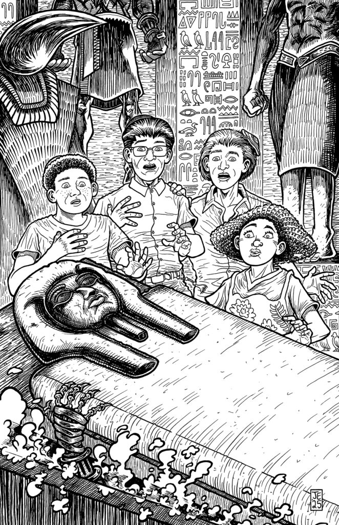
You might notice that, in this inked piece, the sarcophagus is a little larger in the foreground than it was in original penciled drawing. After I finished the penciled drawing, I realized that I wanted the viewer to be a little closer to the sarcophagus, which I thought would be more dramatic. So after inking the piece on the original bristol board, I used photoshop to separate out the sarcophagus and enlarge it. You might also notice that I removed some of the detail on the sarcophagus cover that was in the original drawing; Arnon felt it was more imposing (and also more historically accurate) without that extra stuff.
After scanning the artwork and doing some clean-up work in Photoshop, I emailed it off to our colorist, Aljoša, who knocked this one out of the park with his gorgeous and evocative colors. Once we added in the wonderful logo designed by Arnon, we had our beautiful finished cover!
I love this cover!! I think it’s the best cover of any of the projects Arnon and I have done together.
I’m so proud of this comic book! I can’t wait for readers to get to see it and experience this story.
Please click here to order the book. Thanks for supporting my work!