Creating a Comic Book Page: José and the Pirate Captain Toledano!
Today I wanted to peel back the curtain and walk you through how I created a page of my graphic novel, José and the Pirate Captain Toledano!
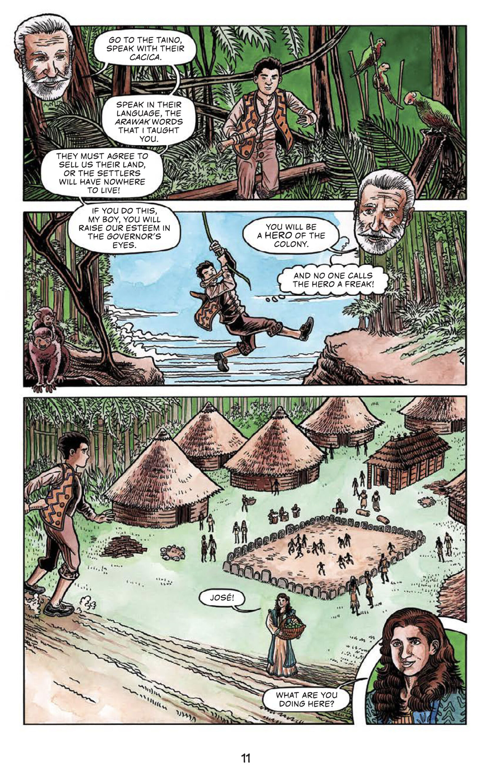
Today I’m going to be digging into page 11 of of José and the Pirate Captain Toledano. On this page, we follow our main character, José, as he makes his way from Santa Domingo, where he lives, to a nearby Taino village. The Taino are very important in our story. We also get to meet an important supporting character on this page: José’s friend Rosa.
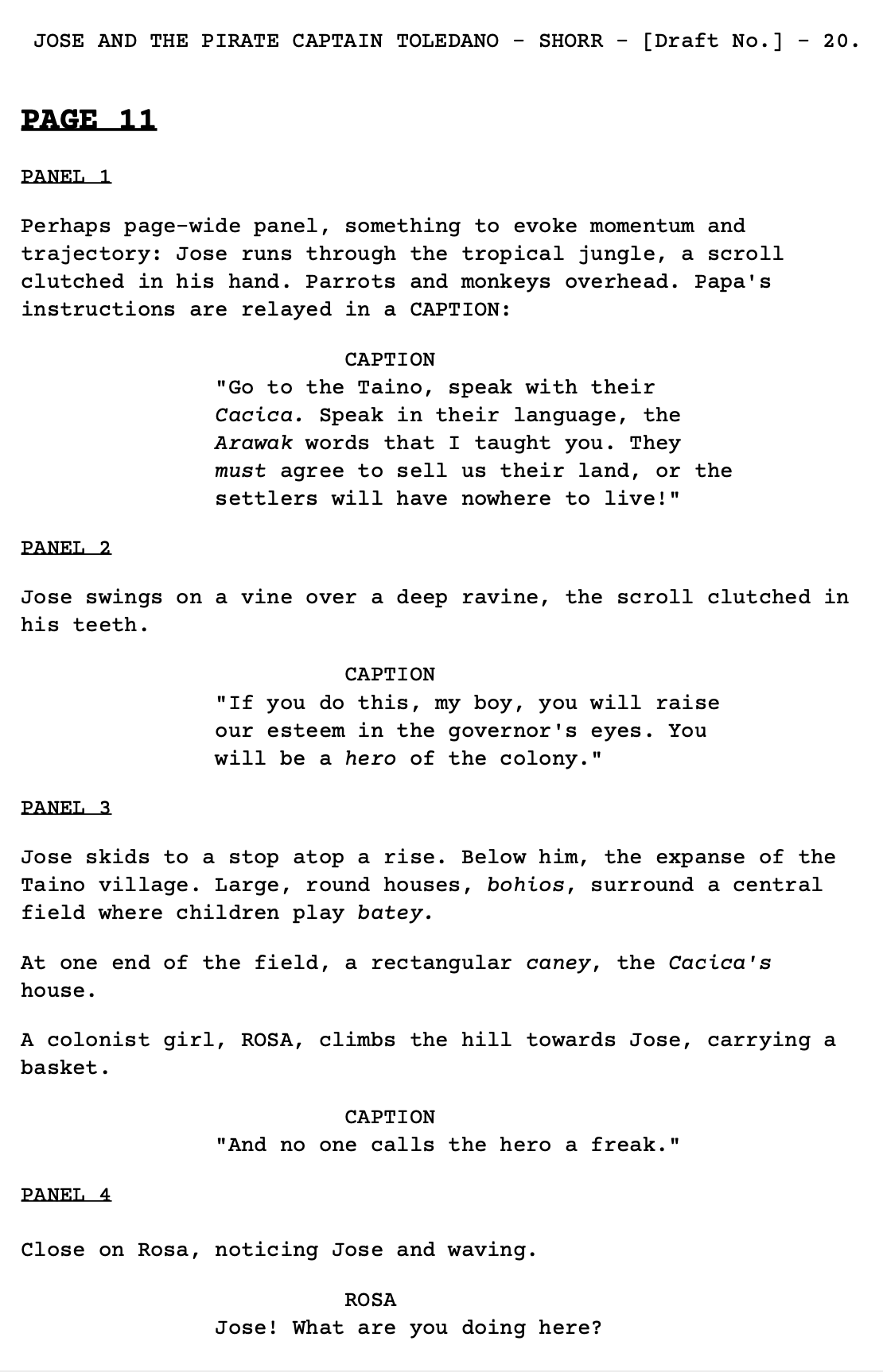
Here’s Arnon’s script for this page:
In thinking about how to translate this script into an illustrated comic book page, I made a few key decisions. First, I decided that I felt the largest panel on the page should be panel three, which is our first glimpse of the Taino village. While there are of course always exceptions to this rule, in general I think it’s a good idea for every page to have one panel that serves as the central image. I feel this helps give focus and direction to the narrative on that page. So in thinking about each page, I try to think about what I feel is the most important or dramatic moment or image on that page, and then express that visually in my design of the page.
Second, you’ll see that Arnon’s script contains the idea that we’re reading Papa’s instructions to José as captions, while José runs through the jungle. I loved this juxtaposition. I thought it’d be fun and useful to try to express this visually, so I came up with the idea that we’d see Papa’s head floating on the page, speaking those words to José. I thought the visual of Papa’s head breaking through the panel borders would be a fun and striking image on the page, and I liked the idea that we could convey that Papa’s words are ringing in José’s ears as he treks through the jungle to the Taino village.
Arnon suggested using panel-wide panels to show José’s running through the jungle, which fits in well with my style. I often use long and wide panels in my pages. I like the “widescreen” cinematic look that gives my pages. So I used that idea for all three large panels on the page. That left me with the puzzle of how best to fit in Rosa’s introduction in panel four. I decided to give her a circular “insert” panel in the bottom corner of the page. Using this unusual circular panel shape would make Rosa’s introductory panel stand out, even though it’s a relatively small panel compared to the other three on the page. I wanted her first panel to be special, and also to be a strong concluding “beat” on this page, one that would give the reader the desire to quickly turn the page to see what’s next. (That’s always important when thinking about one’s page design! One of the many great aspects of Arnon’s script is that he always thought carefully about the best last moment on each page; something to give us momentum into the next page. You want to keep the reader turning those pages!!)
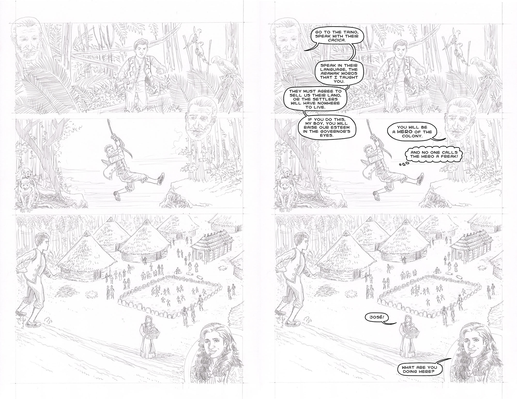
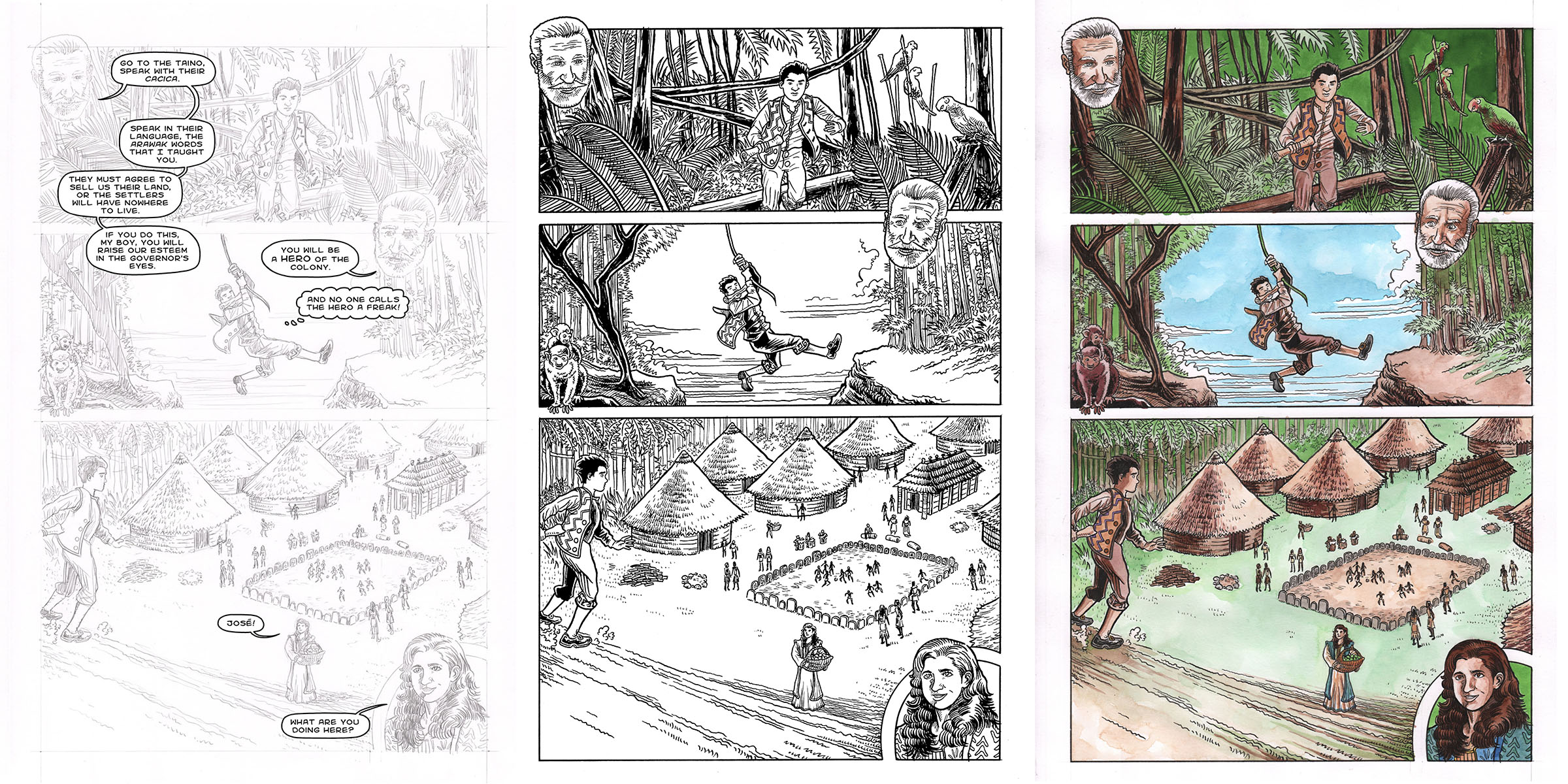
Here’s my pencil sketch for this page:
You’ll see on the right side of the above image that, at this stage, I also added in rough word balloons. (I did this on the computer.) For me I think that is critical, because the magic of comics is in how the words and pictures work together. Before I go any farther in polishing the page, I want to be sure the storytelling is working smoothly, and for that it’s essential to see how the words and images are working (or not) together.
At this point, Arnon and I would look at the page together to make sure we were both happy with it. Arnon suggested that I slightly reduce the number of Taino we see in the village, because they are already suffering from disease at this point in the story. So you’ll see that difference in the version on the right.
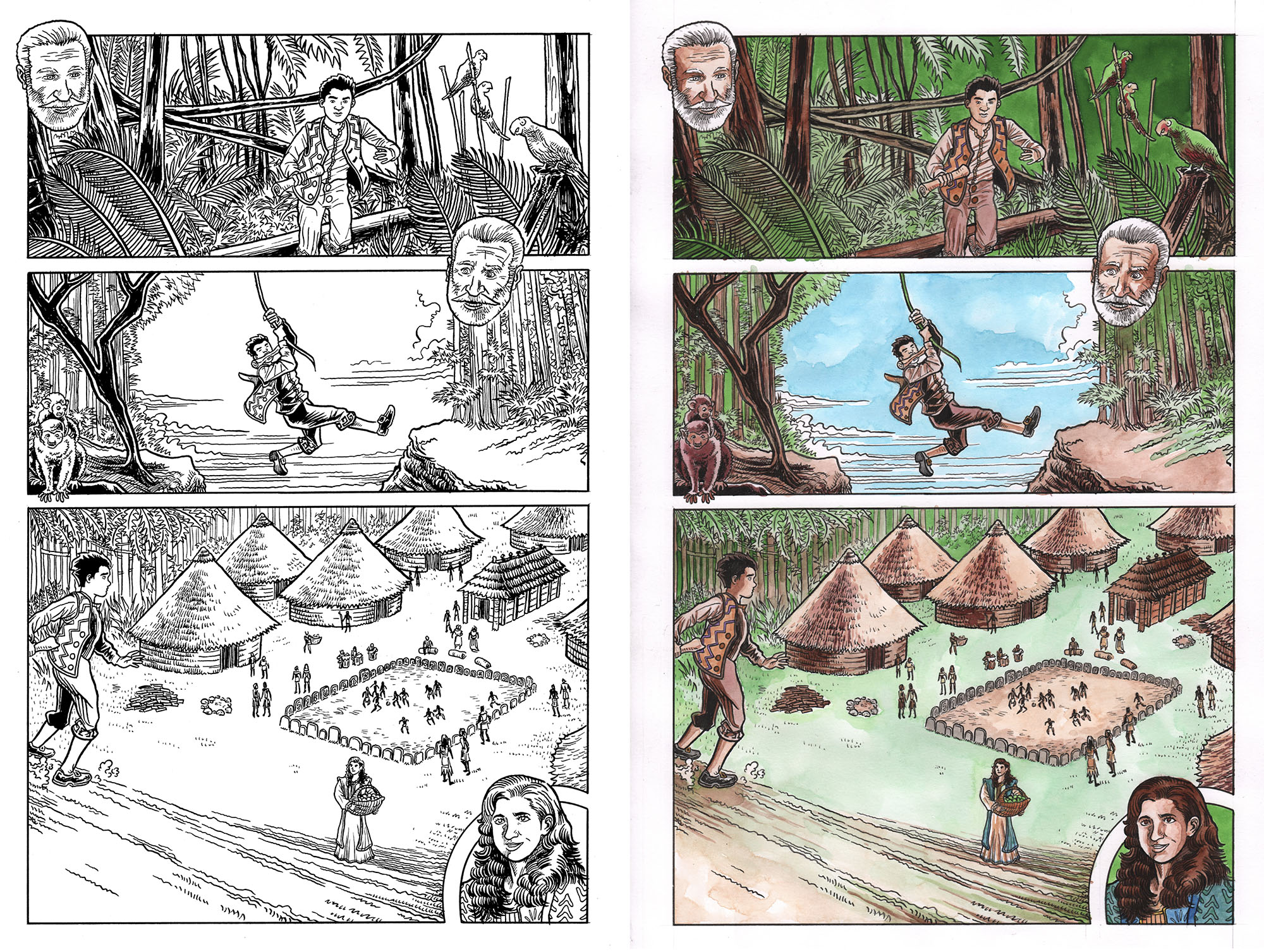
Once we were both happy, I inked the page, and then I painted it. I use watercolors and dyes (concentrated water colors). I do all of this by hand, on paper.
Then the final step is to combine all the layers. These final stages I do on the computer. I scanned the inked page before I painted it, and I combine that with a scan of the painted page so that I can get nice crisp black lines on top of the watercolors. Then we finalize the word balloons and all the text (all of this is done in Photoshop) and, voila, we have our final page, ready to go:
I hope you enjoyed this look at the creation of page 11 of José and the Pirate Captain Toledano! The graphic novel is available right now from Kar-Ben Publishing, or click here to order it from Amazon! It’ll make a great Hanukkah gift…!!
Thanks for reading!
Please support my website by clicking through one of our Amazon links the next time you need to shop! As an Amazon Associate, I earn from qualifying purchases. That means I’ll receive a small percentage from any product you purchase from Amazon within 24 hours after clicking through. Thank you!
